App Store Connect Help
Sufficient Contrast accessibility evaluation criteria
Description
Sufficient Contrast helps users whose vision is reduced due to a disability or situational impairment such as bright sunlight. Users can increase or adjust the contrast between text or iconography and the background, improving readability.
Goals
Everyone should be able to use your app, regardless of whether they have a disability. The goal of the Sufficient Contrast feature is to support low-vision users who may have reduced visual acuity, clarity, and/or contrast perception.
The following sections provide more detail about how to determine whether your app supports Sufficient Contrast well. The goal is to help ensure users with disabilities can leverage all common tasks of the app, therefore performing this evaluation will help you determine whether to indicate your app Supports Sufficient Contrast on the App Store.
Getting started with testing
The accessibility settings for each device include a number of features that can help users customize contrast to fit their needs. Most users that have a need for higher contrast will enable the settings for Bold Text, Increase Contrast, and Reduce Transparency. You’re not required to use the built-in system settings, but testing with them on may give you an understanding of the contrast minimums your users expect. If you offer your own in-app setting, it should either support similar functionality to the systemwide settings, or offer more granular user interface customization.
Enable all three settings before testing your app for sufficient contrast. Review the resources below for details about turning on these settings for each device your app supports.
-
For iPhone, visit Change display colors on iPhone to make it easier to see what’s onscreen.
-
For iPad, visit Make text easier to read on iPad.
-
For Mac, visit Make text and icons bigger on Mac and Change Display settings for accessibility on Mac.
-
For Apple TV, visit Display bold text on Apple TV and Increase Apple TV screen contrast.
-
For Apple Vision Pro, visit Text display settings on Apple Vision Pro and Adjust colors and contrast on Apple Vision Pro.
-
For Apple Watch, visit Adjust text size and other visual settings on Apple Watch.
You can check the contrast of elements in your app by using Xcode’s Accessibility Inspector or other color contrast checkers to determine contrast ratios for elements in your app. Most modern accessibility guidelines recommend a minimum contrast ratio of “4.5 to 1 between foreground text and its background” based on a formula provided by the World Wide Web Consortium’s (W3C’s) Web Content Accessibility Guidelines.
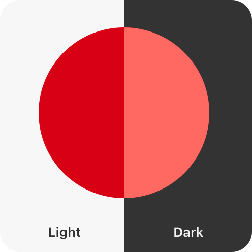
If your app supports Dark Mode, be sure to check the minimum contrast in both light and dark modes. A common mistake is supporting sufficient contrast in your light mode interface, but forgetting to support sufficient contrast in a dark interface. Many developers use gray-on-black for dark mode reading, which can reduce eye strain for standard vision in low-light scenarios, but this reduced contrast variant may be more difficult to read for those with low vision or light sensitivity. Consider testing your app while combining the dark mode color scheme alongside the Increase Contras setting.
Consider not only contrast, but also translucency (opacity/blurring) of your background materials, controls, and content. Include legibility of text, icons, and other content, elements, and controls in your evaluation. Remember to test with Increase Contrast on and Reduce Transparency off, and with both settings on.
Make sure to provide sufficient contrast on interactive controls and non-text representations of a state, such as a selection. For example, if you design a custom checkbox, make sure there is sufficient contrast between the checked and unchecked states. Meeting a 3:1 minimum contrast ratio is commonly recommended for non-text contrast.
If you don’t have an existing proficiency in testing sufficient contrast, take some time to go beyond the basics. Review Strive to meet color contrast minimum standards in the Human Interface Guidelines to understand if the contrast of adjacent colors in your UI meets minimum acceptable levels.


Indicating support for Sufficient Contrast
You may indicate your app supports Sufficient Contrast if the user interface for your common tasks, including text, buttons, and other controls, meets general contrast guidelines by default — usually 4.5 to 1 for most text elements.
If your app doesn't provide this minimum contrast by default:
-
If your app uses Apple-provided UI frameworks, verify that the Increase Contrast setting applies sufficient contrast.
-
If your app supports custom frameworks, provide users with a choice of multiple color schemes that meet contrast minimums.
-
If third-party or user-generated content is required in your common tasks, refer to the detailed guidance for third-party content on the Overview of Accessibility Nutrition Labels.
Even after you’re able to indicate support for Sufficient Contrast in the common tasks of your app, there are likely further improvements you’ll be able to make to the accessibility of your app. Re-evaluate your app’s support for Sufficient Contrast every time you update the app. Set a goal to make your app more accessible to more people in every release.